
Thursday, 8 December 2011
Alcatraz Escapes 14 ways off the rock!
This project was my final for Advanced Typography. We were to do an info-graphic about a man made object or a timeline of events. I choose to do a time line of events about the 14 prisoner escapes that occurred during the 29 years Alcatraz was operating as a prison.

Sunday, 4 December 2011
Derivative designs for my Corporate Identity final project

Friday, 2 December 2011
Cornucopia Brochure project for Production Procedures.
Here's something I'm particularly proud of. Although you can't see it on the jpeg. Once printed this brochure would have spot varnish on certain parts and images.


These were designed with the intent of displaying them in stores around whistler and the lower mainland. To promote the different events and give some general information about Cornucopia. The thing I did not design as it was not needed for the project but would be needed in reality was the display box that would hold the brochures.


These were designed with the intent of displaying them in stores around whistler and the lower mainland. To promote the different events and give some general information about Cornucopia. The thing I did not design as it was not needed for the project but would be needed in reality was the display box that would hold the brochures.
Sunday, 27 November 2011
MS Hawk Inc Logo's


A black and white and full colour version of a logo that was designed for MS Hawk Inc a local bird control company. I was really happy with how this turned out in class and with a slight tweak before handing it over to my client it was perfect. Also a note for those who think it may not scale well. During a test run it scaled to a small size without losing any detail.
Saturday, 26 November 2011
Logo Design for AVV productions a Local Vancouver Event Planner.

This is the logo design I created for Arlayghna (Arlene) Viccto a local event planner in Vancouver. It was a pleasure working with Arlene on this project. I wish her all the best in her dynamic career.
Thursday, 24 November 2011
The 3 final hand in versions for my Concept Development Class Razor Mens Spa.

The concept development final. Classmates didn't seem to follow the concept but I was happy with the end result. The previous entries for this project seen earlier on my blog were the step before this revamped version. I hope you enjoy.


Wednesday, 23 November 2011
Stopping Spam

This was my Second Quarter Illustrator class final project. I went from not being able to draw at all to creating an image in Illustrator.
Friday, 19 August 2011


Monday, 15 August 2011
Early Letter Form Prints
An assignment for Typography. We had to take an early letter form and create three posters about it, emphasizing something different in each but still keeping them consistent.
This is the Glyph emphasized.

The Text emphasized.

The Name emphasized.

Sunday, 14 August 2011
My Life Drawing Portfolio


Foreshortening/Perspective section.
Pencil on newsprint


Line Drawing section.
Pencil on newsprint


Proportion section of my portfolio
Pencil on newsprint
My Life Drawing Portfolio


The Shading Section of my Portfolio.
Done with White Charcoal on black paper.
And Pencil on Newsprint.


Tuesday, 9 August 2011
Raining in the City

The Art of Latte magazine spread.

Advanced Photoshop Midterm:
Well it goes to show you working under presure is not a problem for me. This little gem took me just under 4 hours to do.
Project: Read 4 articles and choose one to create a magazine spread. I choose "The Art of Latte" article which was all about the Latte art compititions that are happening all around us. Hope you enjoy.
Monday, 27 June 2011
Perfection Face Scrub
This is the packaging for my colour theory final project
 |
| Front notice the double decker bus on the bridge |
 |
| Side it was important for me to wrap the whole image around as the packaging to give the whole cohesive look |
 |
| Back. In this case the ingredients and bar code were used for all of the products packaging it cut down the amount of time needed to look up medical ingredients for this project. |
 |
| Side. The second pillar holding up the bridge and the completed package. |
The digital Vancouver
I did these pictures for my final colour theory project. Liked them so much they get posted before the packaging they created lol. Photo's and art are my originals mine and mine alone hahahaha.
 |
| Burrard Bridge view from Granville Island |
 |
| Steam Clock in Gas Town |
 |
| Granville Street entertainment district |
 |
| Waterfront Station |
Monday, 20 June 2011
Wizard of Oz re imagining book cover
This was a project for Fundamentals of Design.
I really enjoyed this one, we had to take a classic book and re imagine the cover. I choose The Wonderful Wizard of OZ by L. Frank. Baum. We were to create one design seen in my pencil drawing then create 3 variations of colour themes.
 |
| Base design drawn with pencil then scanned so I could work in Photoshop. |
 |
| My first colour theme |
 |
| Number 2. |
 |
| And finally my personal favourite my 3rd colour theme. |
Sunday, 19 June 2011
Book Cover
 |
| This is a book cover I created for digital imaging at AI This is a made up book called Surrounded based on shadow people and the paranormal. |
Event Posters for my Digital Imaging Final at AI
I really enjoyed this project. We had to create 4 posters for events that are actually happening around Vancouver. While maintaining the feel of the event and being conscious of the target audience. I feel that I hit the nail on the head when it came to these 4 events.
 |
| Biltmore Cabaret Presents Thee Oh Sees with special guests Chains of Love and Bare Wires |
 |
| Dancing of the Edge Contemporary Dance Festival |
 |
| The Vancouver Symphony Orchestra presents Lehar's The Merry Widow |
 |
| VIVO presents Signal and Noise 11 This is above all my favourite event poster that I created. There is just something about this one that captures my eye. |
Self Portrait
 |
| This is my self portrait compared to the photograph I was working with. |
 |
| This is a close up of my self portrait. This was done in pencil |
Adam and Eve Editorial Piece
 |
| Eve Before I worked my magic |
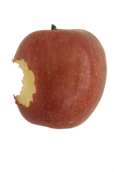 |
| The apple before me |
 |
| Adam in the Woods |
 |
| After my Magic This was my early photoshop work one of my first assignments in Digital Imaging at AI. |
 |
| The Apple of Knowledge |
 |
| And finally Adam in the Jungle As you can see this assignment was an editorial piece. My subject matter was Adam and Eve after Eve took a bite of the Apple. |
Subscribe to:
Comments (Atom)